Women's Shelter Rebrand
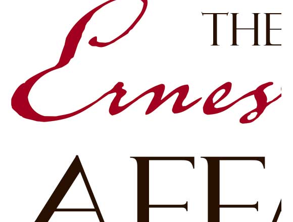
Standing Up for WomenErnestine’s Women’s Shelter has been a refuge since 1983 for women and their children fleeing abuse. When the shelter asked me to design a new identity, they were burdened with a logo and look that was worse than simply dated – it did not represent the strong women sheltering and working at Ernestine’s. To begin, I asked if I could design a brandstorming activity with the women and children living at the shelter. The sessions allowed these brave women to articulate the experience of living at Ernestine’s, and as always this primary research proved to be instrumental in my design process. The logo designs I presented featured bold graphics and symbols that avoided “feminine” clichés. Ernestine’s chose power and simplicity: an exclamation mark replacing the apostrophe conveys urgency, a solid ‘gender-neutral’ font conveys strength.. The new branding was adapted to all print collateral and digital media.The Ernestine’s rebrand forms the foundation of a comprehensive marketing strategy designed to empower the shelter to help more women and their children escape abuse.